The note font was inspired by my personal handwriting and was designed to be used for headlines. The main purpose of the font was to create something that is uniquely identifiable. The main demographic is 20–30 year old male designers that are looking for something chaotic in nature with a handwritten flare. Furthermore, it was designed to be used on printed goods. More specifically, handmade cards, packaging, posters, and album covers. The reasoning behind this decision was to give these mediums a better alternative typeface design.
During the process of doing my research, I discovered there weren’t many rough and chaotic handmade sans-serif fonts in the font world. My typeface would therefore, not only fit my brand, it would fill in a gap in the font world and create a more human alternative in the marketplace.
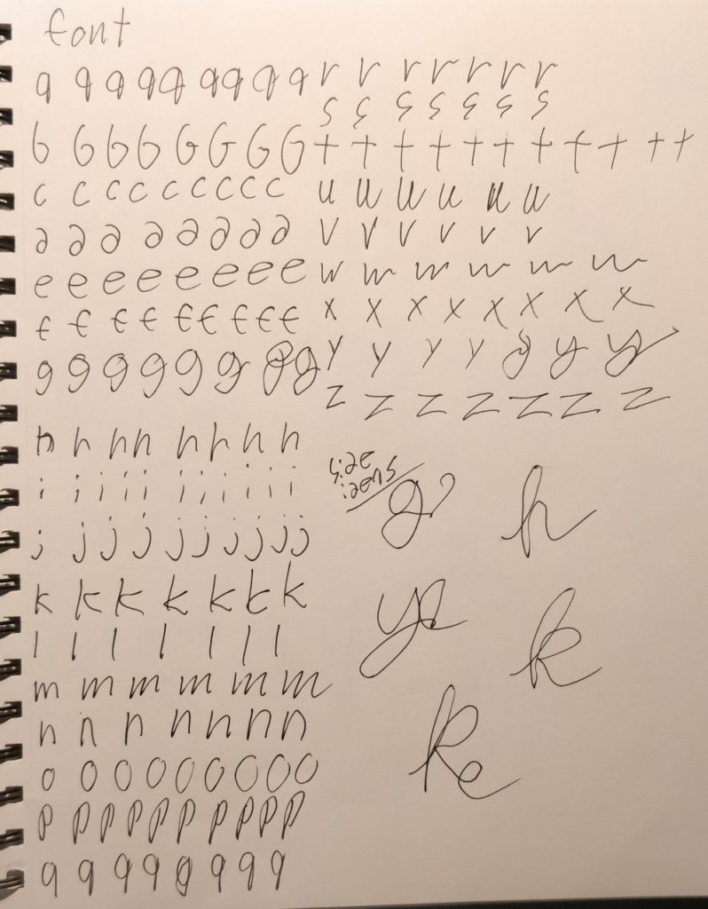
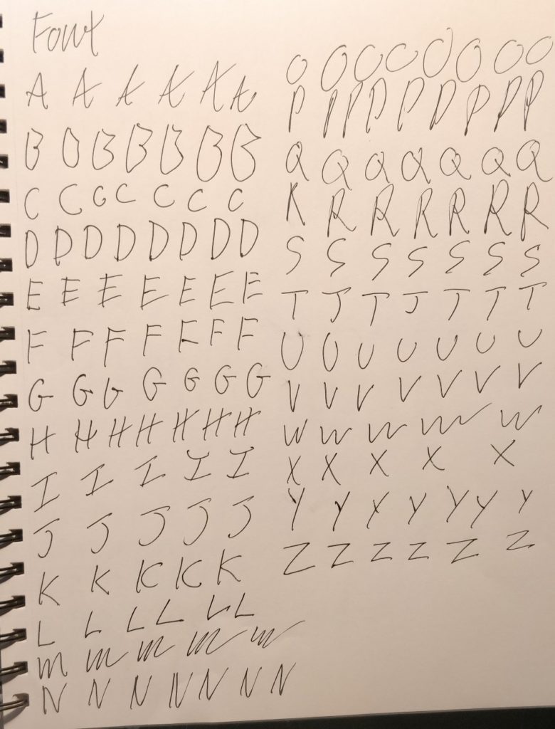
The Brief was about creating a personal brand, having a full social media redesign, with a letterhead, envelope, business cards, and a personal website. By incorporating the Note typeface in my personal brand, I was able to mix two concepts into one and elevate them both. The research started with me looking at a lot of sans-serif fonts. Once I decided what kind of style I was going for, I started sketching out versions of the regular style of the font. It was rough and too fine to be legible.
The next idea was to just scan in my hand writing and make it a font. It was too rough and chaotic for readability. Then I edited my handwriting and tried to make it more unique, but it was even less readable. This was cleaned up and made more legible from a distance.
Though clearer, it was not quite clear enough. Making it bolder then stylized it some more. Still not readable enough to say it was done. The next step was to clean up my stylization, then make it more readable and cohesive as a font.
The main point of a typeface is to be readable. The more readable something is, the more people will understand the message you are trying to send. This project taught me that it is always more important to make the font more readable, rather than unique.
Examples
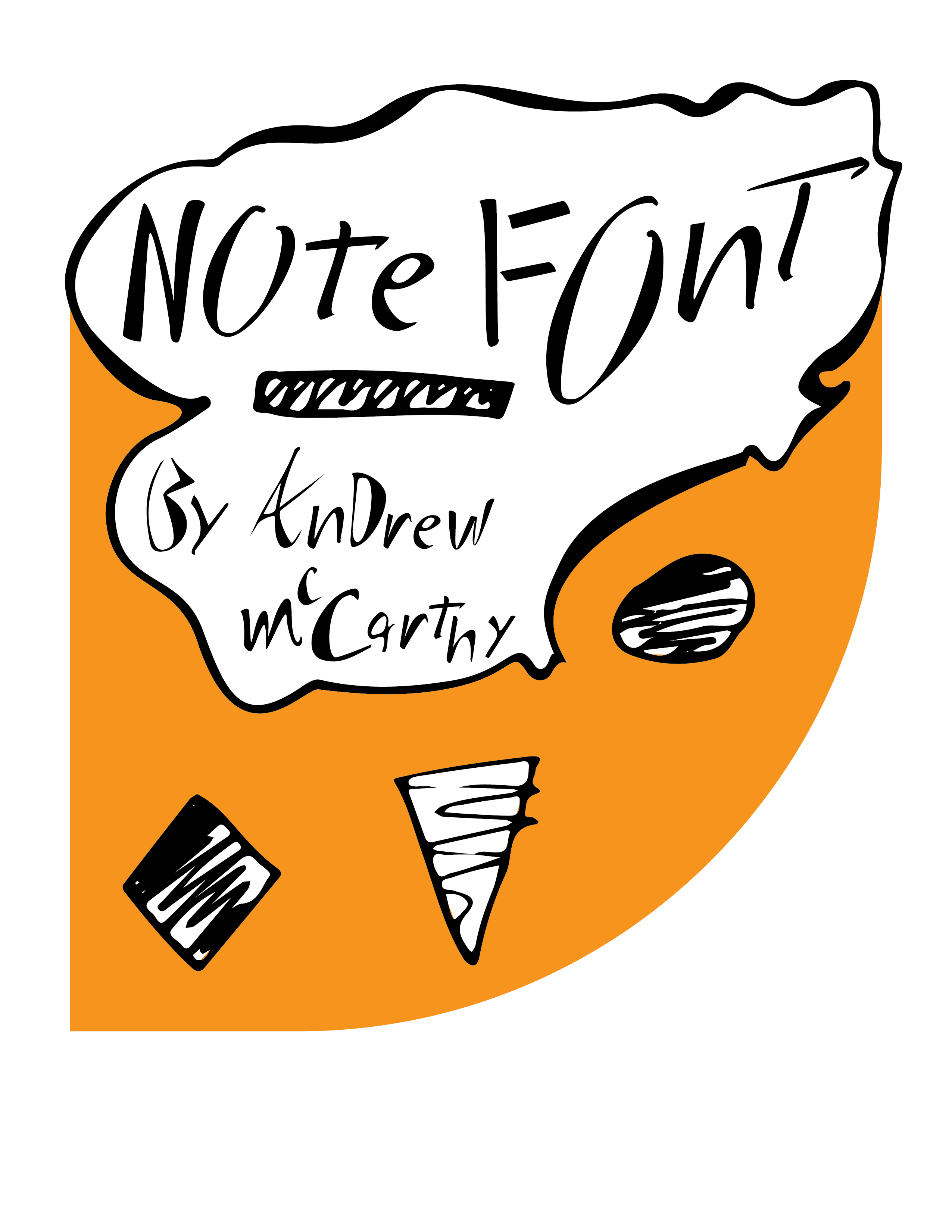
The final iteration of the Note typeface, was decided based on the feedback from the client. The client requested that the color be bold and lively in tone. The color chosen was used as an art device and emphasized the tone of the Note font. A color that would best reflect this tone was chosen. The specific color was a bright orange, and it was received as a dynamic color. The client described it as enthusiastic, fascinating, and yet creative in nature, and was exactly what the client was looking for.
Through peer feedback while deliberating on the specific style I was able to to determine what weight was best suited for the client. Additionally, they helped me choose what specific shade of orange to use.
The Note font is a bold chaotic sans-serif, with a handcrafted style that is uniquely thick & thin at the same time. This creates greater movement and flow while being eye catching.