An innovative company that is known for they’re alternative pop-up overlay. They help customers find and make the purchases they want, either by making a website “UI”, or by making specific ads for them. They are upbeat, positive, and straight forward. Their typical clientele are company owners, advertising managers & entrepreneurs.

Company looking for a redesign that represented the brand, was up to date and a better fit with the current market. The brief said that Ve Global wanted a logo that could be displayed as one, or two solid colors.
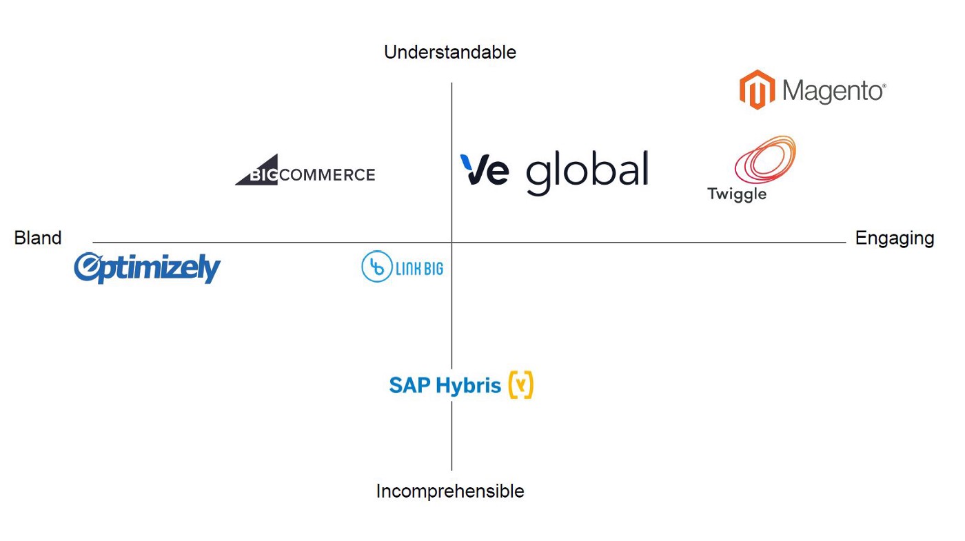
First I gained an understanding of the marketplace, their consumer and the branding of their major competitors. Then I began my brainstorming process which led to sketching monograms with “V” and “e”.
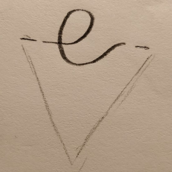
These sketches became my starting point, and I began the development of the logo from there. It provided me with a direction and helped me work out exactly what I was going for.


The next idea was a “e” wrapped around the “V”. This ideation was more towards the tone and feel the client was looking for. However, it was hard to read at a distance.

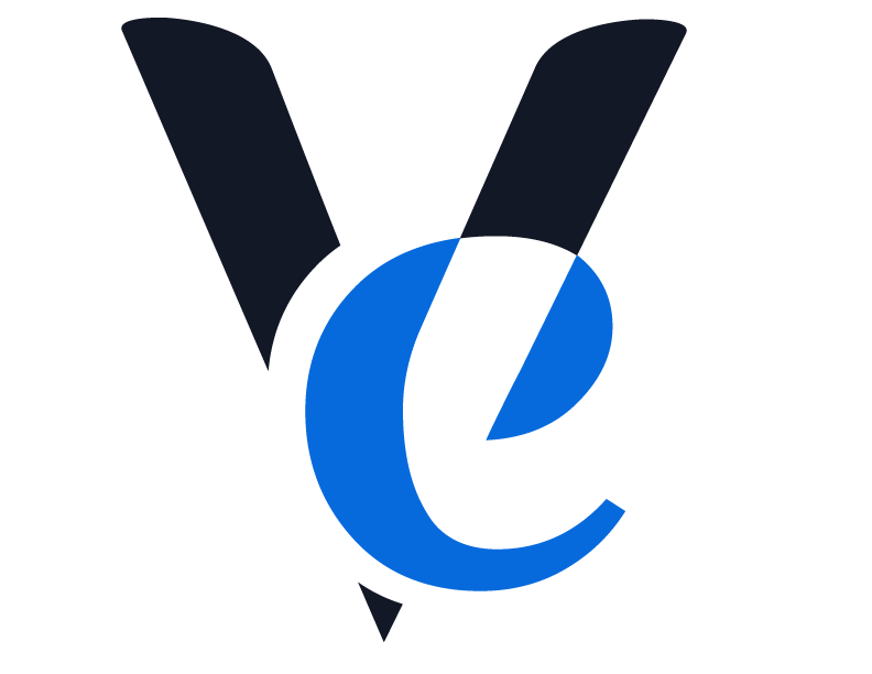
After going through some colour trials, a solid black with bright blue was chosen as what would best suit the brand. The black color represents strong and straight to the point, while the blue stands for trustworthy and reinvigorating.

My next version of the logo was good, but the tip on the end drew the eye down and not to the right, so I removed the tip and reversed the colors. Satisfied with the look of the logo I started working on the brand identity.
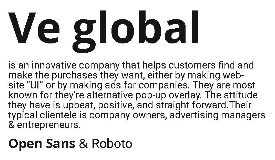
Beginning with the typeface I chose, Open Sans & Roboto. This particular pairing has both modern and humanist qualities in common. They are easy to read at a distance in both print and digitally.
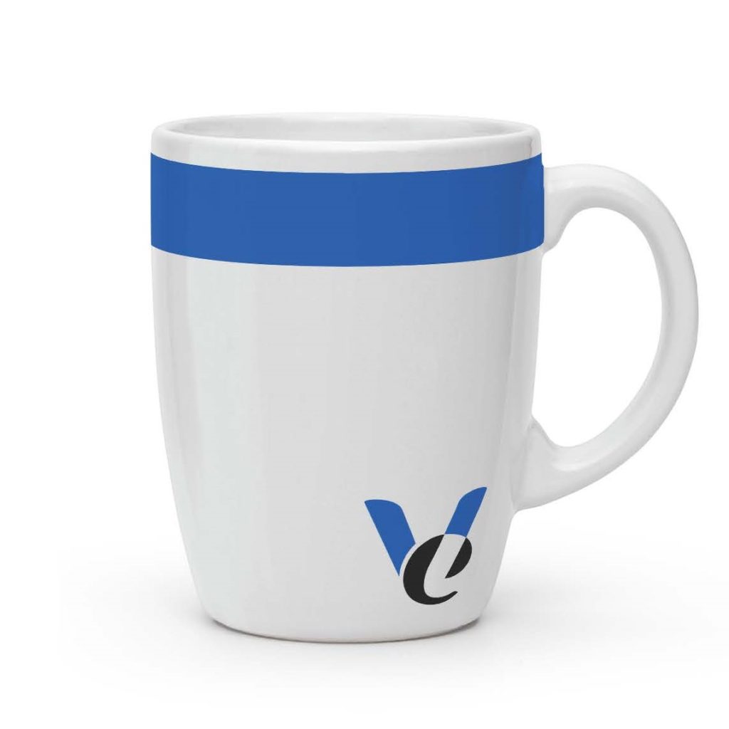
The mug was selected because it is both a practical and unique parting gift.

The swoosh of the “e” of the logo, was used throughout all of the pieces to draw your eye. The goal was to create an object that would capture the attention of the viewer, and would be a defining feature to tie all the pieces together.